
01 — PROJECT OVERVIEW
projectór
Outfit inspiration app — from a founder’s idea to a launch-ready iOS product
I helped turn an early-stage founder idea into a coherent consumer product—defining its structure, core experience, visual system, and launch-ready interface from the ground up. Projectór is the consumer face of a creator-monetization platform: looks come from fashion creators, and AI decomposes every outfit into shoppable, affiliate-linked items.
ROLE
Product designer · zero-to-one
PLATFORM
iOS
SCOPE
Concept, IA, UX flows, UI system, launch
02 — THE INITIAL IDEA
Creators drive the sales—and see none of the profits
Founder Kate Deyneka came with a sharp observation: fashion creators generate enormous product discovery, but the money flows around them. Their followers screenshot outfits and search manually, while creators rarely benefit from the buying intent they create. There was no specification yet—my job was to help shape the product itself.
The creator
Drives product discovery but loses attribution, revenue, and ownership of the audience relationship.
The shopper
Moves from inspiration to screenshots, browser tabs, and uncertain product matches.
The market gap
Connect creator taste, AI-assisted product matching, and affiliate commerce in one focused experience.

03 — MY ROLE
Founding designer for a zero-to-one product
Working directly with the founder—an ML lead with deep creator-economy expertise—I translated broad product ideas into defined user journeys, prioritized MVP functionality, and iterated on the experience throughout development. I owned the entire design surface: product concept, information architecture, user flows, wireframes, interface system, final UI, and launch preparation.
Idea
Hypothesis
Wireframes
Founder review
Prototype
Launch
04 — PRODUCT CONCEPT
Three verbs: discover, understand, keep
VALUE PROPOSITION
Open the app—see outfits that match your style and budget, understand what each look is made of, and keep the ones you love.
For the audience, Projectór is a calm, editorial feed rather than another catalog. For creators, every saved look and product click preserves the connection between inspiration and attribution.
01 · Looks beat garments
People respond to complete visual ideas before individual products.
02 · Two inputs are enough
Style preference and budget provide enough signal for a useful first feed.
03 · Inspiration must be actionable
Every look should break into recognizable, purchasable items.
04 · Saving drives retention
A personal collection gives people a reason to return beyond the feed.
05 — INFORMATION ARCHITECTURE
One quiet structure: four tabs, one deep flow
The architecture keeps navigation shallow so the feed remains the center of gravity. Everything around it—onboarding, saved looks, product detail, and profile settings—supports the same loop: discover a look, understand it, save it, and return.
Feed
Discover
Saved
Profile
Core flow
Feed → Outfit detail → Product decomposition → Similar items → Save look → Saved collection → Return to feed
06 — KEY USER FLOWS
Four journeys that carry the whole product
Rather than mapping every screen, I focused on the journeys users repeat. Each one is shown here with the screens that shaped it and the decisions that reduced friction.
01 · Onboarding → personalization → first feed
Ask only for the minimum useful signal, verify the account, set style and budget, then reward the effort immediately with a relevant feed.

02 · Discover an outfit → view details → save
Keep the look visually dominant, reveal product controls only when needed, and make saving feel like the natural next action.

03 · Outfit → product decomposition → similar items
Translate the visual look into understandable items, preserve creator attribution, and offer alternatives without losing context.
04 · Saved collection → revisit → continue browsing
Give saved looks enough structure to become a personal style library rather than a dead-end favorites list.
07 — INTERFACE SYSTEM
A system quiet enough for the content
The interface stays deliberately restrained. Typography establishes hierarchy, neutral surfaces protect image quality, and compact controls appear only when they help users understand or act on a look. The system was documented so development could extend it without redesigning each state.
Type hierarchy
A compact scale separates editorial titles, product names, price, metadata, and helper copy.
Color roles
Black anchors action and navigation; warm neutrals keep photography dominant; accent color is reserved for meaningful states.
Controls
Pills, filters, buttons, tabs, and save actions share predictable sizing and feedback.
Layout rules
Stable spacing, image ratios, and card anatomy keep the feed varied without becoming visually noisy.
08 — EDGE CASES AND PRODUCT STATES
Designed for the days when nothing goes right
A feed app lives or dies on its unhappy paths: empty filters, slow networks, missing photos, blocked onboarding, unavailable products, and incomplete recommendations. Each state keeps the same tone as the rest of the product—quiet, informative, and always offering the next useful action.
Empty feed
Explain why no looks match and offer a one-tap way to broaden filters.
Loading
Preserve the layout with image and text placeholders so the feed does not jump.
Network error
Keep the user’s place, state what happened, and provide a clear retry action.
Unavailable item
Retain the outfit context and prioritize close alternatives rather than a dead end.


11 — FINAL PRODUCT EXPERIENCE
The final experience
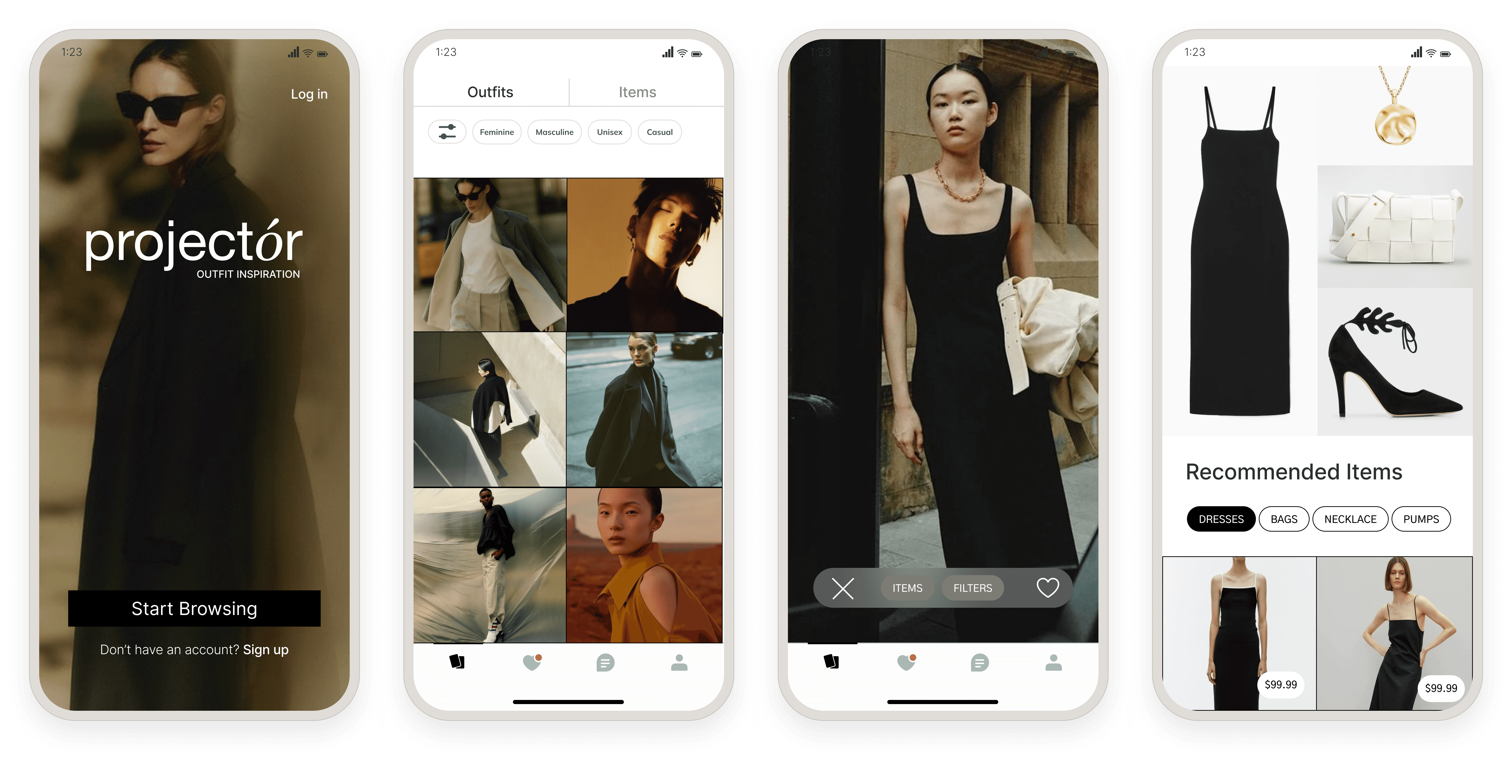
The shipped MVP connects the complete loop: a focused onboarding, a personalized feed, full-screen outfit discovery, AI-assisted item decomposition, recommendations, saving, and a personal collection. The interface stays monochrome and nearly invisible so photography does the talking.


13 — OUTCOME AND LEARNINGS
Outcome
A one-line idea became a working, shipped product: a defined structure, four core user journeys, a scalable monochrome interface system, and an iOS app in real users’ hands. An initial cohort of creators and early users moved through TestFlight, with the App Store release prepared. Aligning the app, system, and launch process created the foundation for the founder’s creator-monetization vision.
I helped turn an early-stage founder idea into a coherent consumer product—defining its structure, core experience, visual system, and launch-ready interface from the ground up.
The biggest lesson was to protect the product’s central promise. Every successful design decision made inspiration easier to understand and act on; every weak one introduced another layer between the creator’s taste and the shopper’s intent.