
01 — PROJECT OVERVIEW
Yembo.ai
Making an AI property platform clear and market-ready
I built a flexible visual language for Yembo across product, sales, campaigns, and events—turning complex AI-powered property survey workflows into stories customers could quickly understand.
ROLE
Marketing Designer
TIMELINE
March 2023 – August 2024
SCOPE
Brand, product storytelling, campaigns, events

02 — COMPANY & PROJECT CONTEXT
An AI product that was easier to build than to explain
Yembo is an AI-powered property survey platform used by moving and insurance companies to document homes remotely. Its technology was sophisticated, but communicating its value required translating technical workflows into something customers could quickly understand.
Over eighteen months, I supported the company across a wide range of customer-facing touchpoints. Rather than treating each request as a standalone asset, I worked to create greater visual and narrative consistency between the product, brand, sales, and marketing experience.

03 — THE CHALLENGE
Not more assets — one flexible visual language
The core challenge was not producing more assets. It was creating a flexible visual language that could explain a technical product consistently across different audiences, channels, and levels of detail.
Complex technology
AI, property surveys, operational workflows, and multiple customer use cases — communication had to be understandable without oversimplifying the product.
Many audiences
Prospects, existing clients, sales teams, partners, conference attendees, and product users all needed different levels of detail.
Many formats
Presentations, campaigns, social media, event graphics, web assets, educational materials, and product-related initiatives.
Need for consistency
The company needed to look like the same organization across every one of these touchpoints.
04 — MY ROLE & COLLABORATION
Working across marketing, sales, product, and events
I worked with marketing and product stakeholders to:
Translate technical capabilities into accessible customer-facing stories
Establish repeatable visual patterns for campaigns and communications
Design sales decks, presentations, digital campaigns, event collateral, and web assets
Create and organize image directions for different property categories
Support selected product features and interface improvements
Maintain consistency between the product experience and external brand presentation
I collaborated daily with Art Director - Rita Sus, and worked closely alongside the founder, the marketing team, and the sales team. Projects ranged from quick-turn campaign production to larger systems and presentation narratives — including brand asset libraries, banners, tradeshow materials, social templates, and sales one-pagers.
05 — VISUAL SYSTEM
A practical visual language for customer-facing communications
Rather than a full rebrand, I established reusable rules for hierarchy, color, typography, graphic elements, and spacing—enough structure for campaigns, sales decks, social content, and event materials to feel recognizably Yembo.


06 — PHOTOGRAPHY & IMAGE DIRECTION
A structured image library, not decorative stock
Because the platform works with residential property imagery, photography was not simply decorative. I organized image directions by room type, property context, orientation, and communication need, making it easier to select consistent imagery across campaigns and presentations.
07 — PRODUCT STORYTELLING
Turning product complexity into a clear sales story
Sales and marketing materials needed to communicate what the technology did and how it affected the customer’s workflow. I used structured hierarchy, diagrams, product visuals, and repeatable page patterns to make technical information easier to scan and present.


08 — EVENTS
Extending the brand into conferences and live events
Event design brought its own constraints: long-distance readability, limited copy, and recognition in crowded exhibition halls. Large-format graphics, booth panels, screen displays, and event materials translated the same digital-first system into physical space.

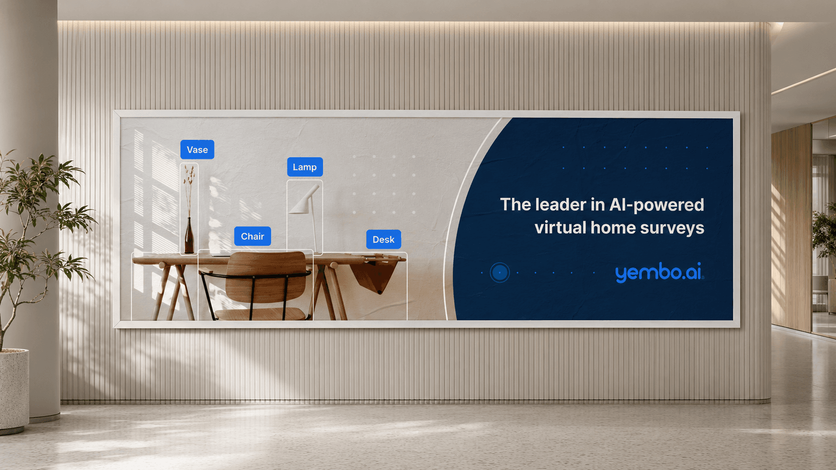
09 — OUTCOMES
What the work changed
One visual language extended across sales, web, social, events, and selected product touchpoints. Technical product information became easier for non-technical audiences to understand, while reusable campaign families and page patterns helped the team produce new materials faster.
Consistency
One visual language extended across sales, web, social, events, and selected product touchpoints.
Clarity
Technical product information became easier for non-technical audiences to understand.
Reusability
Marketing teams received repeatable visual patterns — campaign families and page templates — instead of one-off assets.
Speed
New materials could be produced faster because hierarchy, imagery, and layout decisions were already made.
10 — REFLECTION
Consistency comes from systems, not static rules
Consistency in a B2B company cannot come from a static set of brand rules alone. It has to come from systems that accommodate different audiences, product stories, content densities, and production timelines.
Looking back, I would formalize the reusable components earlier and introduce a shared campaign and presentation library to reduce duplication across teams.